Color is a power which directly influences the soul.
Wassily Kandinsky
Coming from a foreign culture, I have experienced culture shock and a startling number of misunderstandings during my years living in the United States. The differences between east and west are more drastic than I imagined. Take family values for instance. In China, people value the “family bond” and “collective power”. On the other hand , Americans appreciate individualism; they encourage their kids to express themselves and “be different”. As a result, effective cross-cultural communication can be elusive on nearly every level. With this in mind, I have designed a visual system of text translation, a color-coded system that taps into “pre-verbal” communication and deeper meaning.
Most artists and designers incorporate color in their practices, and the success of their works are relevant to their understanding of how to use colors. Wassily Kandinsky is one of my favorite artists, he believes that colors can affect the soul and spirit. In his book, Concerning the Spiritual in Art, he consider that color and form are two weapons of painting.He made a case for the importance of colors and its associations with forms that can create spiritual effects: “ This essential connection between color and form brings us to the question of the influences of form on color. Form alone, even though totally abstract and geometrical, has a power of inner suggestion.” He also indicates that only the third element accounts for the timeless in art ,“which knows neither period nor nationality.” Influenced by the color theory of Wassily Kandinsky, I would like to use color to articulate human emotions and feelings in my thesis project.
Ikko Tanaka is a Japanese graphic designer, art director and editor, who’s famous for his poster designs, which are fusions of western modernism and traditional Japanese esthetics. His works are strong, clean and colorful. One of his most well-known poster design is Nihon Buyo, designed for Asian Performing Arts Institute in 1981. The way how he marries geometric shapes with traditional Japanese geisha figure is a novel to graphic design history. I’m quite inspired by the grids that he created in his abstract works, so in my thesis I’m seeking a way to create a system that can generate grids cohesive to the assigned content.
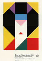
Close-up of Japan, London 1985, Ikko Tanaka
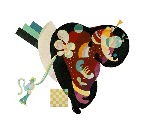
Composition IX, 1936,
Wassily Kandinsky
Background
Translation is a supremely challenging activity. Something is bound to be lost. The translation between Eastern and Western languages is difficult because of the differences of language forms and symbols, grammar, syntax, intonation, history, culture, and religion. The Chinese language has a Sino-Tibetan origin, and the English language has an Indo-European origin. The languages have radically different alphabets. Chinese uses logographic forms as their written language while English uses twenty-six letterforms. Chinese words and sentences are created differently than English words and sentences. So, when translating from Chinese to English, a translator is always at risk of losing meaning, nuance, mood, and cultural references embedded in the language itself. It is nearly impossible to translate the sound and form of Chinese into another language. But those sounds and forms have unique significances in Chinese poetry.
As the world is increasingly globalized, language translation becomes a more important international and inter-cultural activity. Translation has existed ever since humanity start spoken languages. The first written proof of interpreting dates back to 3000 BC, at which time the Ancient Egyptians had a hieroglyphic signifying “interpreter". According to the demand of business development after the Industrial Revolution in mid-18th century, translation as a specialty have become formalized.
Poetry is a special, self-conscious way of employing language. It is very unique compared with other forms of literature. American poet Robert Frost suggested that poetry was what was left behind in translation. He meant that context, culture, literary history, and more all contribute to the nuances and associations a poet intends to be understood in poetic verse, and those are nearly impossible to recreate in a poem translated from one language to another, especially translating between cultures or even historical periods.
Translating a Chinese poem into English exemplifies the challenges of translating poetry. To start, they do not share alphabets. So it is difficult to match words in English with the words in Chinese poetry. Classical Chinese poetry presents difficulties in translating across historical and cultural time periods. The imageries, associations, and histories described in classical Chinese poetry are evocative symbols that represent and imply the poet’s emotions and thoughts. Intonation and rhythm are especially hard to preserve when translating Chinese poetry to English. Intonation and rhythm are critical in any poetry. They contribute to the meanings in classical Chinese poetry, and they are what makes Chinese poetry resonate with meaning and sound beautiful.
Colors plays a pivotal role in human visual experience. The nature of colors associated to human’s mood changes, in art and design, it is been widely used as metaphor of emotions. Compared with language, color is more universal, and it speaks to a wider audience. Evidence shows that it is inevitable that colors influence our decision making. In a study by Secretariat of the Seoul International Color Expo 2004, 92.6 percent people said that they put most importance on visual factors when purchasing products. Only 5.6 percent people said that the physical feel via the sense of touch was most important. Hearing and smell each drew 0.9 percent. In addition, another study shows that color can improve comprehension by 73 percent.
About Vivid Verse
Chinese characters are designed according to 17 structures/grids. With the 17 variations, I generate grids according the structures of each Chinese character in poems. In addition, I curated 7 positive emotions, such as courage, ecstasy, contentment, happiness, joy, optimism and anticipation; and 7 negative emotions, such as fear, melancholy, contempt, apathy, sadness, anxiety and worry. And then I mix each of the two colors into gradient combinations. Therefore, I get 3 swatches, they are Positive to Negative Emotion Swatch, Positive to Positive Emotion Swatch and Negative to Negative Emotion Swatch. I applied gradient options to sentence grids according to the emotions of characters and the poem.