I have always been interested in synesthesia. In literature, It refers to a technique adopted by writers to present ideas, characters, or places in such a manner that they appeal to more than one sense at a given time. For example, in the first canto of Dante’s The Divine Comedy, the poet tells us about a place called the Inferno. He says, “Back to the region where the sun is silent.” Here, Dante binds the sense of seeing with the sense of hearing.
The sounds we hear tell us a lot about our surroundings. When I close my eyes, I can imagine the scene based on those sounds. The dynamic relationships among sight, hearing, and imagination were my inspiration for my graduate thesis project at MICA.
As a graphic designer from China, I am not familiar with typeface design and typography. They are very new for me because of the difference of Chinese characters; therefore, when I began to think about my thesis project, I wanted to explore typeface design together with synesthesia. I wanted to explore the relationship between scenes and soundscapes, looking and hearing.
I did a lot of research before I began my thesis project. There are so many artists, designers, and even scientists who want to visualize music or sound. In history, Music notation or musical notation is any system used to visually represent aurally perceived music through the use of written, printed, or other symbols, including ancient symbols or modern musical symbols. In the 1950s progressive composers broke from the 5-line music staff to experiment with new, more expressive forms of graphic music notation.
Daniel Reed of Sheffield, UK, has used metal cymatics plates to create a series of cymatics images of piano notes. Of his project, Daniel says: “I used cymatics as the inspiration and basis to form each square (note). I did this by using an amplifier and putting paper with salt on top , I played each note on the piano and when the salt vibrated it moved the crystals and in some cases settled and formed patterns. I used some artistic licence when constructing the images and plotted the shapes by studying how the crystals moved. I then converted the formations into the vector images.” “Each note or sound has a frequency and Hz value, specific equipment allowed me to play each note into a plate which vibrated. In order to get a visible pattern, sand is poured on top of the plate, when the note is played the sand settles and forms the shapes…”
I was inspired by the method he created and wondered if I could create a new visual system.
I call architecture frozen music. Johann Wolfgang Von Goethe
I call typeforms frozen sound. Ran

A quote I like is: “ I call architecture frozen music.” This was said by Johann Wolfgang von Goethe, quoted in Peter Eckermann’s Conversations with Goethe. I found a lecture called, “Can music data be frozen into architecture?” by Jan Henrik Hansen in a TED talk; he is a Zurich-based architect/artist/designer who turns (time-based) music into (space-based) physical sculptures and architectural structures. That made me wonder if sound data could be frozen into a letterforms to form a typeface. What would the typeface sound like? What would the typeface look like in specific sound scenes?
After the research, I thought about my design system. I wanted to create letters that changed dynamically over time in response to the sounds in the environment. Specifically, I sought to craft letters that somehow moved in reaction to aural stimuli. The stimuli would be sounds recorded from daily life. Therefore, I had to create a visual system for connecting sound and visual elements together. Sounds from our environment could change the appearance of the letters. Letterforms could grow bigger or smaller in response to the specific sound. This was my initial idea.
My first job was to choose locations and record the sounds. I went to New York City. New York is a vibrant city that has quiet places like Central Park and noisy places like Times Square. Those rich, sonic environments were good resources for sound data. I wrote down a list of what I heard in the specific scenes. For example, at a park in the morning, I heard people walking and running, birds chirping, a fountain splashing, and dogs barking. I recorded the audio with a professional Sony sound recorder. When I returned home, I listened to the audio tracks and chose the best recordings.
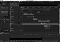
The next step was to transfer the best audio tracks to Adobe Audition, the software program that allowed me to edit the audio. The sound in our environment is often too messy and complicated. So, instead, I decided to isolate the many sounds onto 9 tracks in order to create the aural environment. I thought of this process as being similar to cooking. Sounds are like raw materials, and when you put them together, the combination gives the full flavor of a complete dish.
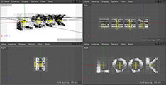
I created a 15 by 15 two-dimensional square grid and drew letters on the grid to create one single letter. I used 3D software to draw letters into a 3D space, repeating the letter on to 9 layers for the 9 sound channels. Different sounds will affect different layers of a letter.
After transferring sound qualities to visual forms, I used the 3D geometry to build the new visual system to respond to the recordings of environmental sounds. I input the shapes to the letters into the grid. When the sound started, each point would affect the sizes and forms of the specific point on letters, and then, when the 9 layers of letters mixed together based on each sound, it would show different styles of the forms based on real time and the situation.
In order to show a variety of dynamic letterforms, I chose 5 sound scenes from our familiar everyday life: a park, a street, a cafe, a subway and an office. And then I selected the pair of words “look” and “hear” as the letters that would react to the environmental sounds.
When you hear the sound from the animation, you see the word “LOOK,” and the title is “ Scene 1.” Then you see the word “HEAR,” and the scene is identified as a “Park.” This is a way to trigger associations about aural and visual signals, sight and hearing.
In addition to changing the sizes of the geometric shapes, I changed the angle and direction based on the original shapes to build an atmosphere of the real visual scenes, such as the subway scene. Although the basic shapes come from a cube, I stretched both sides of the cube as a long rectangle to show the look of the subway.
In the exhibition space, I created a 3D letter sculpture, Interactive screen, main video wall, print letter "O,” and two books. Every design element in the exhibition space supports one system but with a different method.
For the letter sculpture, the material is black, hard paper. I folded 68 geometric 3D objects from the visual system I created to build the letter “O” as the beginning of my exhibition. I want to give the visitor a 3D perception. And then, beside the sculpture, an interactive flat screen analyzes the sound from the surroundings and shows different shapes based on sound frequency. People in the exhibition space can play with the interactive screen. I used a software called “processing” and input the library “minim” to analyze sound from the microphone on screen. Visitors can provide any sound, even music, to generate dynamic change in the letters of “LOOK.” And in the middle of the space is my main 3D typeface animation. It includes 5 different sound scenes which generate shifting typographic forms. A big sound dome in the front of the animation and an “ O “ signage on the ground give visitors a clear sound quality. I printed 80 different “O” shapes generated by the animation and mounted them on the 80 black boards. I used fishing line to connect them together to build a pattern wall.
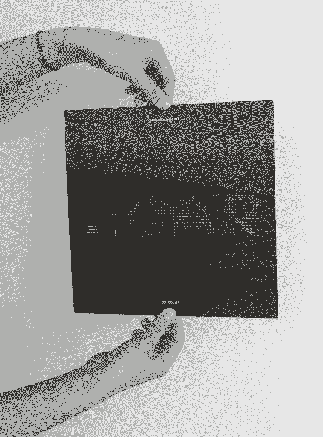
In the exhibition, there are two books that I put in different exhibition locations. The small book is just 6”x 6”, and it shows the basic system and how different sounds manifest as dramatic shifts in shape which then change the appearance of the actual letter. This book is under the interactive screen, and when visitors play with the screen, they can read the book to get a better understanding of the project. The big book documents the sounds and static frames of the typeface.
There are two important details in my exhibition. The first one is the book holders I created for the two books in the exhibition. I used a duplicate of the letter “O” from my 3D sculpture. This idea came to me on installation day. I wanted to find a holder for the big book on the pedestal in order to make the book stand out from the flat vinyl description. When I was thinking about that, I found I still had some 3D objects I hadn’t used, so I thought I could use them as holders. The other detail is the sign on the floor just below the Sound Dome. The shape of the sign follows the same structure of the 15 x 15 grid I used to draw the letters. These two details made my exhibition much more uniform.
This project still has a lot of possibilities to explore, not just the shapes but also the color and texture of the letters.
